Sparkling and shimmering inks are a Big Deal right now. It started with J. Herbin’s 1670 Anniversary ink, Haematite, which is a lovely, deep red with a subtle gold shimmer. Further Anniversary inks followed. Most notable of these was Emerald of Chivor, an amazing dark teal with red sheen and gold shimmer. Diamine brought out some of their own shimmering inks a few years after Herbin, some of which I reviewed here. Now de Atramentis are getting in on the act, with their own pearlescent inks.
So, if shimmer inks are a big deal, are we reaching saturation point? (Excuse the pun.) Well, de Atramentis have introduced a little innovation here. Herbin and Diamine have produced ink with a complimentary shimmer colour, but de Atramentis offer a choice of shimmer. Each of the ten ink colours in the pearlescent range is available with gold, silver, or copper shimmer.
The first thing that I noticed on making ink swabs was the sheer amount of shimmer particles in this ink. There is so much more than Herbin or Diamine inks. For many people, this will come as good news. This shimmer is not subtle!
A word on pen hygiene. Many people are reluctant to put shimmer inks in their pens for fear of clogging. I am not overly concerned about this, but I don’t tend to put this in my best pens. I have never had a problem with clogging in my Lamy Al-Stars though, even when I’ve left it in them unused for weeks. The significantly higher concentration of shimmer particles in these inks may make me a bit more reluctant to leave it in pens for a long time.
De Atramentis have kindly offered United Inkdomsome samples of these inks for review. Pure Pens carries some of the colours to buy.
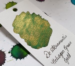
Heliogen Green
The base ink here is a medium green which works well with all three of the pearlescent shimmers.

As you can see from the picture, the different coloured shimmer makes quite a difference to the look of the ink.
Heliogen Green Copper

The contrast of the warm copper and green is really lovely and quite unusual. The de Atramentis inks have a LOT of shimmer particles in them so the effect is easy to see, especially so with this combination. I am not sure this is something I would have bought had I not seen it in action first. However, having used it, I am pleasantly surprised at how well the combination works.
Heliogen Gold
This is another lovely contrast of warm and cool. It is less strikingly unusual and could be compared it to Diamine’s Golden Oasis. Diamine’s offering uses a lighter coloured ink and has a more subtle shimmer, though.
Heliogen Silver

Green and silver are a nice combination, and to my mind, a bit festive.
Cyan Blue

The base ink here is not accurately described as cyan, but is a lovely royal blue.
Cyan Copper
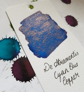
The Copper shimmer again proved to be a successful and surprising combination. The contrast between the blue and the orange copper is beautiful.
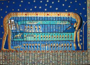
Cyan Gold

The blue and gold is beautiful too, and reminiscent of Ancient Egyptian art with its use of gold and lapis lazuli. A sort of Ink of the Pharaohs?
This was my favourite of the samples I tested.
Cyan Silver
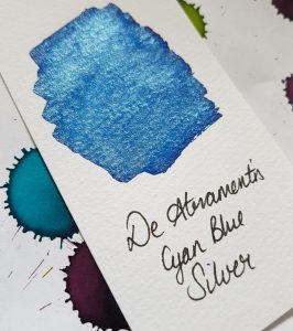
The silver shimmer works really well with the blue ink. It looks like an icy pool in the swab sample. The colours compliment one another very well.
Like the green, the blue and silver combination really shows how much shimmer these inks have.
Brilliant Violet

I expected to like the Brilliant Violet inks more than I actually did. I didn’t feel that any of the shimmer colours went well with the shade of ink.
Brilliant Violet Copper
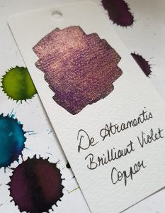
The contrast between the purple ink and copper shimmer did not do it for me. Unlike the contrast with this shimmer and both the Green and Cyan ink, this created a bit of an odd ink that I can’t imagine ever wanting to use.
Brilliant Violet Gold

This is nicer than the Copper. Purple and gold are a classic pairing.
Brilliant Violet Silver

Purple and silver are also a good pairing, and I’m sure this ink will have some fans.
Amber

I only have a sample of Amber with Gold, so I can’t compare to the other shimmer colours, but it’s rather lovely. It looks very pale and transparent when the ink first goes down on the paper but it dries quickly to a lovely warm yellow. The gold shimmer with that shade is quite beautiful.