Calligraphy and lettering is big news at the moment. Instagram is full of gorgeous photos and videos of beautiful writing. As a long-time advocate of writing by hand, I’ve watched the craze grow with interest, and harbour hopes of someday improving my own skills in this department. The simple fact is that to improve, you need to practise, practise, and practise some more. It’s a time-intensive hobby and in the final year of my PhD, I just don’t have the time to spare. Perhaps in 2018!
I do, however, love to browse calligraphy and hand lettering books at the bookshop. One that caught my eye is Nib + Ink: The New Art of Modern Calligraphy* by Chiara Perano of Lamplighter London. I was delighted to receive a review copy from United Inkdom. It’s a beautiful book and one which has been produced to high standards. The paper is thick and the illustrations plentiful.
Pros

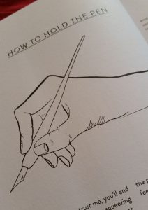
Perano’s illustrations of nibs, pen holders, and most importantly how to hold a pen, are clean and deceptively simple. Lovely nib icons litter the book.
The text is cheerful and encouraging. It’s aimed at beginners and covers all the basics, from where to find supplies, to how to choose which nib to work with. Perano lists suppliers at the end, for both the UK and international markets.
There are guidelines available for free from Perano’s website, and I always appreciate these little content upgrades.
The book is peppered with tips on how to get the most out of your practise, and how to improve your calligraphy.
There are lots of examples to copy, adapt, and use as springboards for your own style.
One of the biggest pluses of this book is that although there is a focus on practice and repetition, Perano is really teaching how to develop your own style. Each letter page has several variations in both the upper and lower cases, which encourages the reader to experiment with each letter.
This is a lovely book, and as I mentioned, the publisher didn’t skimp on production. The paper feels heavy and I think it would take calligraphy ink well if you wanted to practise in the book itself. However, for my money, I’d rather print guidelines onto marker/layout paper and practise on that. That feels like a more economical way to do it, and one where I wouldn’t feel like I’d spoiled this beautiful book with my novice scratchings.
Cons

The variations on each letter are not wide. There are three variations per letter, none of which is vastly different from the other two. Although she advocates developing your own style, if this book is the only one you use, your style is likely to be pretty similar to Perano’s. If you want something more classical, this is not the book for you.
There are a couple of things which Perano skips over which, in a book aimed at beginners, deserved a little more attention. The thing which struck me the most was that she mentions, very briefly, making your own ink using paint, gouache or acrylic. There isn’t really enough information to help you do this- you would have to look online for proper details. She doesn’t mention that if you use acrylic paint, you need to clean that off your nib before it dries or risk ruining the nib.
It depends…

This particular issue will depend on how you use the book:
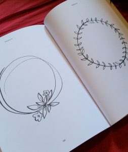
As a result of the intention that you practise in the book, there are a lot of blank pages (more accurately, pages with only guidelines printed on them). I mean A LOT of those pages. By my calculation, fully half the book is blank like this. Each letter page, like the one in the picture above, is followed by a guidelines page, and there are more than ten more double spreads of only guidelines.
If you want to practise in the book, this is useful, but even this amount isn’t enough to level up your skills. You’ll still need to print more (or at least print one sheet to use as a guide underneath your practice paper). This didn’t seem well thought out. If you don’t want to “spoil” the book, then there’s 80-odd pages of wasted space. If you do want to practise in the book, then there’s nowhere near enough.
There is additional “wasted” space at the end, when some fairly simple illustration elements are given entire pages to themselves. I’d have been on board with this if the designs were more complex and merited a closer look, but they seem pretty straightforward.
Conclusions
It’s difficult to come to a decisive conclusion on this book. I like so many aspects of it. I especially like the encouragement to develop your own style and not just to copy Perano’s. It’s a very positive. However, I feel, ultimately, that it lacks depth and variation. I can’t help feeling that all that empty space is an attempt to make up for a lack of content.
*Affiliate link: if you purchase through this link, I will earn a tiny commission at no extra cost to you.


A good and thorough review. I’d like to learn calligraphy and don’t know whether I’d be better with a book or a class.
All the best for the new year! 🙂
Thanks! I hope it’s helpful.
In my (limited) experience, a class is much better. I went to a one-day workshop on Foundational Hand while I was in Italy in 2015 and it was great. The tutor was really good and it’s so helpful to have an expert cast an eye over your work. What looks right when you’re a novice isn’t necessarily what’s really right, and it’s easier to correct problems earlier, before they’ve become bad habits. That said, classes are a lot more expensive and there aren’t a lot of them. The only calligraphy classes I’ve found in Edinburgh, for example, seem to be on Italic hand, which is not of great interest to me.
If you find and attend a class, I’d love to hear about it though!
Happy Hogmanay to you too!