I love ink. One of the main reasons I love fountain pens is that I have a virtually limitless selection of ink colours available to use with these pens. However, I also realise that practicality plays a part. Much as I like unusual, light coloured inks, I don’t use them as often as I use darker or stronger colours. I’m fortunate in that, as a PhD student and university teacher, what I can deem “practical” is much broader than people in many (perhaps most) other fields. I am always excited when I see new inks which combine interest with practicality though. I was therefore delighted to receive samples of Platinum Classics inks to review.

Platinum have recently released a set of six inks which have some interesting and unusual properties: the Classic blacks range. These inks are “made by a traditional Japanese method which only Platinum still use.” They are iron gall inks and so oxidise over time so the ink darkens. The change is visible initially, especially if you put a lot of ink down on the paper. As it dries, it darkens dramatically. This process of darkening continues less visibly over a longer period.
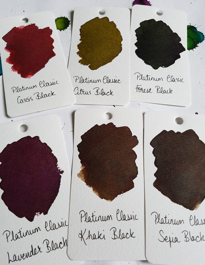
Cult Pens, on e of my favourite source for all things stationery, sent United Inkdom some inks to test out for review. You can see the products here. There are six colours in the Platinum Classics ink range: Citrus Black, Cassis Black, Forest Black,Khaki Black, Lavender Black, and Sepia Black. They are available from Cult Pens for £21.99 per bottle.
Cassis Black
Cassis Black starts out, unsurprisingly enough, the colour of blackcurrant juice, a bright pink-red. It dries to a deep pinky red. I am not a fan of pink at all, but this colour has enough depth to appeal to me regardless. I can see a bottle of this becoming the only pink ink in my collection.

Citrus Black
Citrus Black is an unusual colour, which reminds me slightly of J. Herbin Vert Olive. Unfortunately, I don’t have a bottle of Rohrer and Klinger Alt-Goldgrun which I think might be the closest comparison. Citrus Black starts off a bright yellow with green tones, and dries to a dark greenish gold. It’s one of the most dramatic of the colour changes because it starts off so light in colour. I’ve been getting more and more fond of these sorts of acid greens lately and I like Citrus Black a great deal.

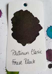
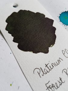
Forest Black
Forest Black is a dark, deep green which changes the least in the initial minutes of oxidation. It starts off dark and gets a little darker over time. There’s a depth to this colour, like all the Platinum Classics, which gives this colour a real richness. In a pen, especially with a fine or extra-fine nib, I think it would be difficult to distinguish this colour from black. That in itself might make it appealing.
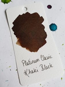
Khaki Black
Khaki Black is a deep, rich warm brown (and not very khaki-like at all, in my opinion). It’s very deep and reminds me of leather- it looks like it should be warm and supple to the touch. I don’t have much need for brown inks, but this is lovely and, like the Cassis Black, I can see it becoming an exception to my (not at all strict) rules. The swatch below also shows the shading of this ink, where a single pass with the brush in the lower left is a much lighter colour.
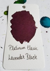
Lavender Black
I suspect Lavender Black will be the general favourite of these inks. It’s a deep red-purple and reminds me of Diamine Tyrian Purple, but Lavender Black is richer and deeper. I think this will prove to be a popular addition to all those purplophiles’ collections (that’s totally a word).
Sepia Black
Sepia Black, like Forest Black, starts out dark and darkens further as it is exposed to the air. This is a very dark brown, almost black but it’s slightly cooler toned than Khaki Black, with the tiniest hint of green. The depth of colour, again, could tempt me to get some brown ink after all.

Iron Gall Inks

As a historian, I find iron gall inks both fascinating, and worrying.
Historically, scribes made this ink by extracting tannic acid from oak galls (caused by gall wasp larvae on trees), mixing it with iron sulphate and binding it with gum arabic (there are variations on this recipe). The result was a very dark purple or brown ink which darkened over time as the iron oxidised. It was easy to make and water resistant so it became very popular in the Middle Ages. It was eventually replaced, after nearly 2000 years of use, in the twentieth century when other waterproof inks were developed.
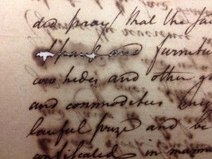
Medieval and Renaissance iron gall inks sometimes damaged the paper on which they were used. This damage takes a long time to take effect, but has, in the worst cases, destroyed the manuscript. The acidity of the ink could eat through the paper and cause it to disintegrate. This is well illustrated in the image to the left, where the ink has eaten through the manuscript almost everywhere it was in contact with the paper or parchment.
Fortunately, modern iron gall inks are made to a different recipe and should not cause any damage to paper, or fountain pens. Modern manufacturers are aware of the potential pitfalls and have compensated, using different acids which are fully oxidised on contact with the air so they don’t damage the paper. That being said, Cult Pens recommends not leaving Platinum Classics inks in your fountain pens for extended periods of time so be aware. It’s better safe than sorry, especially with a beloved pen!